What Is Responsive Web Site Design
Put simply, Responsive Website Design is an approach aimed at responding to the device a user may be using to access your content.
As more devices like mobile phones, watches, glasses and even toasters get a web connection then we have two options. Develop a user interface for each device individually or tailor the same content based on the device.
Responsive design is about presenting the same information (or subsets of that information) to the end user based on their device.
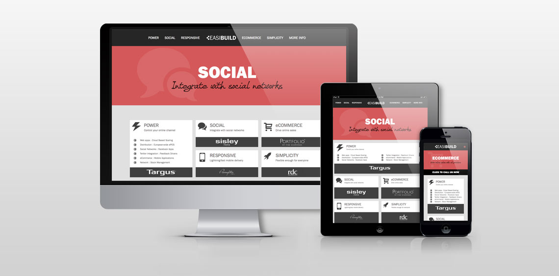
A good example of responsive website design is our own web site for Easibuild Content Management System. We decided that our target audience may use a phone, tablet or desktop computer to view the website. On a mobile phone there is much less screen space available so we hide the main menu unless pressed, in which case it slides into view. We also have a call to action right below the Hero graphic (Call Us!). This isn’t required on a tablet or desktop so will not appear when the screen is a larger size.
At the next size (tablets) we dropped the call to action and have brought the top menu items onto the page. We can also rearrange the layout to make the most of the screen space.
Finally we can make the most of all the space a desktop has to offer and bring elements that may require scrolling to get to on the other devices above the fold on Desktop.
The advantage to our clients is that they only need to update one source and costs are kept low as we only need to adapt the design for three devices.
Some other example sites by us include: